Date axis scaling |

|

|
|
Date axis scaling |

|

|
If you select a date axis on your chart, you can make changes to the formatting of the axis with the tabs available when you select that axis in the Chart Designer dialog box menu. tab displays options for showing the axis scale and entering the values used to scale the date axis. The values you are allowed to specify include the beginning date for the axis, the ending date for the axis, and intervals to pass between tick marks.
The charting utility displays major ticks and grid lines at major intervals, and the minor ticks and grid lines at minor intervals. Axis labels are drawn at major intervals. The following table describes the settings for these options.
Type |
Description |
|---|---|
None |
No Interval. |
Days |
A tick mark occurs each day. |
Weeks |
A tick mark occurs Monday of each week. |
Semi-months |
A tick mark occurs on the 1st and 15th day of each month. |
Months |
A tick mark occurs on the 1st of each month. |
Years |
A tick mark occurs on January 1 of each year. |
For example, to create a quarterly scale, set the interval to 3 months.
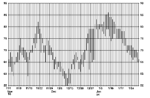
The following illustration shows the use of the Major Format, New Month, and New Year options.

The graphing utility displays dates in this tab using the Windows environment date format assigned though the Control Panel. A confusing situation can occur when using dates earlier than 1920. If you have your date format set to not show centuries, the scale tab assumes the date displayed is between 1/1/1920 and 12/31/2019. So, if you have a date axis minimum of Jan 1, 1905, displayed as 1/1/05, the dialog will convert it to Jan 1, 2005. The solution is to use centuries in your Windows date format if you want to deal with dates outside the range 1/1/1920 to 12/31/2019.
Related topics |