|
This walkthrough makes use of the Solomon's Gold Mine sample project, available with XPAC 7.12 and later versions. You may need to extract the sample project from a zip archive if you cannot find the project file. Remember to start with a clean version of the sample project.
|
This walkthrough describes how to create a simple stockpile report. The report makes use of activity mapping and is broken into four steps:
To create a new stockpiles report from a sample database:
| 1. | In the main XPAC window, either: |
| 2. | In the Windows Explorer window, navigate to the folder. |
| 3. | Select the file and click . |
| 4. | Click on the Tools toolbar. |
| 5. | Select . The window displays. |
| 6. | Click . The window displays. |

|
Do select the existing report, . This is the report you will check your report against when you finish the walkthrough.
|
| 7. | Select and click . The window displays. |
| 8. | In the tab, for each database tab that displays (for example, , ), select data fields that you want to include in your report by selecting fields to and as required from the and lists. |

|
| • | For the report you will produce in this walkthrough, you do not need to add any specific data field. All of the results will be driven by custom, activity mapped fields that you will create later. However, since XPAC does not let you create a blank report, you will need to select at least one field to proceed. |
| • | To extend this walkthrough, you can add any or all of the available data fields from either the or database tabs. |
|
XPAC creates the report.
|

|
This walkthrough section creates two activity-mapped measures at once. You can create one at a time by clicking after adding each measure and returning to step one in this section each time.
|
To create new measures with mapped activities:
| 2. | Map activities to new measures to produce a measure that returns different values (depending on which activity the measure is being used to describe): |
| b. | Select the appropriate field for each activity in the row (, , , , , ), for example, for , select in the field and in the field. |

|
Ensure you complete all activities (you may need to scroll to display the remainder of the activities).
|
| 3. | Repeat steps a and b for . |

| 4. | Do not change the field. |

|
Note that the column automatically populated when you mapped your first field. displays the manner in which the fields in the other columns will be aggregated. XPAC updates the field in this column to reflect the aggregation type most appropriate for the most recent addition you made in the previous step. For example, quantity fields (for example, volume or area) would be added together to make the new measure; quality fields (for example, density or thickness) would be averaged (in this case, a weighted average).
|
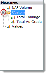
| 5. | Click . XPAC updates the list of measures in the pane. Expand the folder to display the measures that you just created:
 |
|
To build your chart:
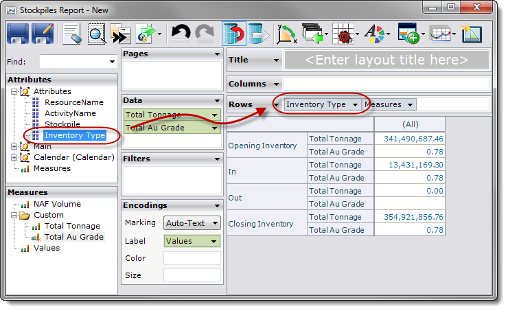
| 1. | Drag & drop each measure ( and ) from the pane to the card. |

|
Note that the fields display the total of all tonnages and the weighted average of grades, across all activities. (You have not yet defined any activities). As a result, XPAC has aggregated each result according to the aggregation types of your custom measures.
XPAC has also added the attribute to the card.
|
| 2. | Drag & drop the attribute from the pane the left of the attribute already in the shelf. You will need to expand the dimension in the pane to display the attribute:

The custom measures deliver different inventory types, depending on which activities are related to each inventory type. This will become more apparent after adding the attribute in the next step. |
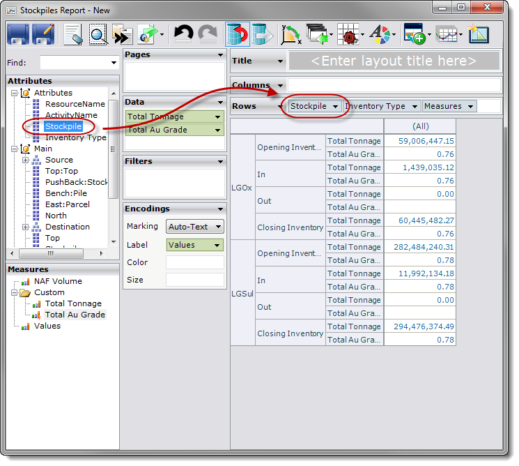
| 3. | Drag & drop the attribute from the pane to the left of the attribute on the shelf. You will need to expand the dimension to display the hierarchy. |

|
Ensure you do use the level (which is part of the hierarchy in the dimension).
|

The chart now displays tonnage, and grade for all stockpiles, broken into the different inventory types and based on the total or weighted average of the data for each activity related to those inventory types.
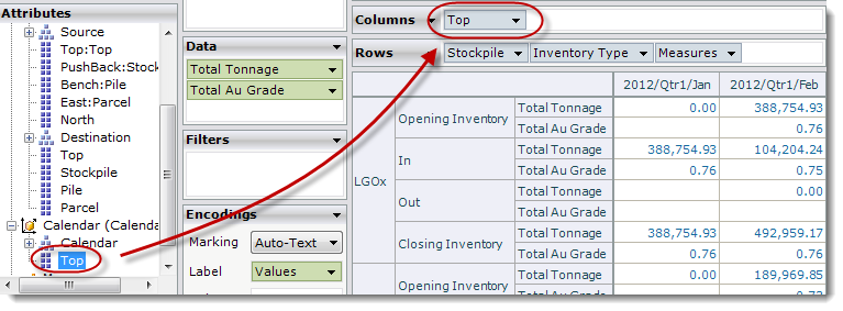
| 4. | Drag & drop the level of the hierarchy from the pane to the shelf:
 |

|
The data is now in place, but differentiation between activities is not clear. To make the results clearer, you can use a colour legend.
|
| 5. | Drag & drop the attribute from the pane to the shelf on the card. |
| 6. | Type a title for the report in the card. |
| 7. | Click on the analysis reports toolbar. |
| 8. | Export the report to your preferred output format so that you can compare the report you just created against the saved report. |
| 9. | Close the current window. |
Check your working against the provided with the sample project.

|
If you close the report, next time you open it, XPAC opens the report in mode. You will need to click on the toolbar to get back to mode.
|
|
Creating an analysis report is much quicker and easier than using scripts or custom queries. Once created, you can manipulate the report even further to achieve the results you want. Try the following alterations to the report that you just created:
| • | Remove the attribute from the chart: |
| 1. | Drag & drop the attribute in the shelf back to the pane to remove it from the report. |
| 2. | Drag & drop the attribute to the shelf (to where the attribute previously was). |

|
You will need to make the same change to the attribute you use as the on the card too, otherwise the chart will try to display all colours at once. The chart will show all of the activities that relate to each resource. For example, the will include the total (remember, was additive) of the volumes of all mapped activities related to the resource. This will not make much of a difference with the existing rows, because you mapped all the activities, so move to the next step.
|
| • | Create a new activity map where you map only one of the activities (use a new name). Use the new measure in the table you have created, placing it on the card shelf next to the similar measure. |
| • | Add the hierarchy to the chart by dragging & dropping the hierarchy between the hierarchy and the attribute on the shelf. You can now see the movements between the and the showing totals for the activities you mapped. |
| • | Display movements without cluttering the chart rows by dragging & dropping the hierarchy away from the card and using it instead as a . |
| • | Display each individual activity by dragging & dropping the attribute to the card. XPAC splits the chart into a page for each activity. You can now use the control to switch between each activity. |
|


