XPAC Reference Guide

Schedule report with activity mapping walkthrough

Schedule report with activity mapping walkthrough

Previous topic Next topic  

Schedule report with activity mapping walkthrough

Previous topic Next topic  

Note

This walkthrough makes use of the Solomon's Gold Mine sample project, available with XPAC 7.12 and later versions. You may need to extract the sample project from a ZIP archive if you cannot find the project file. RPM recommends starting with a clean version of the sample project.

This walkthrough describes how to create a simple schedule report. The report makes use of activity mapping and is broken into four steps:

hmtoggle_arrow1Creating a new schedule report from a sample database

To create a new schedule report from a sample database:

1.In the main XPAC window, either:
a.Select File > Open; or
b.Press Ctrl+O.
2.In the Windows Explorer window, navigate to the Sample Projects folder.
3.Select the Solomon's Gold Mine file and click Open.
4.Click Run Scenario on the Tools toolbar.
5.Click OK.
6.Select View > Analysis Reports. The Analysis Reports window displays.
7.Click New. The Choose the Report Type window displays.

Note

Do not select the existing report Activity Mapped Schedule Report (as this is the report you will check your report against when you finish the walkthrough).

8.Select Schedule Report and click OK. The Import Report Data window displays.
9.In the Database Fields tab, for each database tab that displays (for example, Main, Calendar), select data fields that you want to include in your report by selecting fields to Add and Remove as required from the Available data fields and Selected data fields lists. These fields display as measures when you build your analysis report.

Information

For the report that you will produce in this walkthrough, you do not need to add any specific data field. All of the results will be driven by custom, activity mapped fields that you will create later. However, because XPAC does not let you create a blank report, you will need to select at least one field to proceed.
To extend this walkthrough, you can add any or all of the available data fields from either the Main or Calendar database tabs.
10.Click OK.

XPAC creates the report.

hmtoggle_arrow1Creating new measures that return different results, depending on the activity

Information

This walkthrough section creates four activity-mapped measures at once. You can create one at a time by clicking OK after adding each measure and returning to step one in this section each time.

To create new measures with mapped activities:

1.Click Import Report Data > Activity Mapping (see Activity mapping for more information). The Activity Mapping window displays.
2.Map activities to new measures to produce a measure that returns different values (depending on which activity the measure is being used to describe):
a.Type Total Volume in the Measure Name field.
b.Select the appropriate field for each activity in the row (NAF, PAF, LGSul, HGSul, LGOx, HGOx), for example, for Total Volume, select NAF Volume in the NAF field and LG Oxide Volume in the LGOx field.

Information

Ensure you complete all activities (you may need to scroll to display the remainder of the activities).

3.Repeat steps a and b for:
Total Tonnage
Total Density
Total Au Grade.

activity mapping dialog completed

4.Do not change the Display Folder field.

Information

Note that the Aggregation Type column automatically populated when you mapped your first field. Aggregation Type displays the manner in which the fields in the other columns will be aggregated. XPAC updates the field in this column to reflect the aggregation type most appropriate for the most recent addition you made in the previous step. For example, quantity fields like volume or area would be added together to make the new measure; quality fields, like density or thickness would be averaged (in this case, a weighted average).

5.Click Apply. XPAC updates the list of measures in the Measures pane. Expand the Custom folder to display the measures that you just created:

new custom measures

hmtoggle_arrow1Building a chart from these measures

To build your chart:

1.Drag & drop each Custom measure (Total Volume, Total Tonnage, Total Density and Total Au Grade) from the Measures pane to the Data card.

Information

Note that the fields display the total of all volumes and tonnages respectively, and the weighted average of densities and grades across all activities. (You have not yet defined any activities.) As a result, XPAC has aggregated each result according to the aggregation types of your custom measures.

XPAC has also added the Measures attribute to the Rows card.

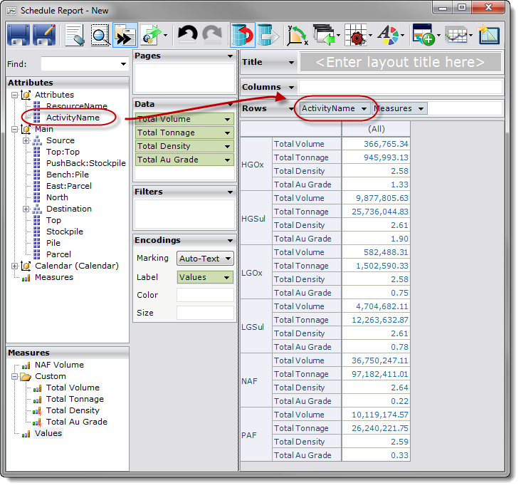
2.Drag & drop the ActivityName attribute from the Attributes pane to the left of the Measures attribute already in the Rows shelf. You will need to expand the Attributes dimension in the Attributes pane to display the ActivityName attribute:

adding the activity name

The custom measures deliver different results for different activities. Check your values against the values at the end of the walkthrough.

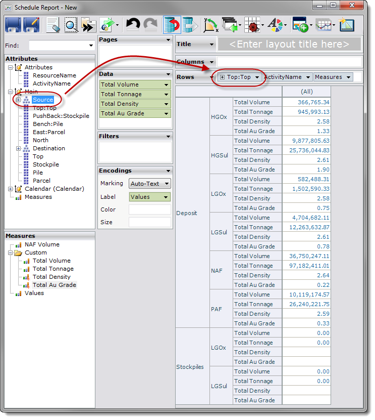
3.Drag & drop the Source hierarchy from the Attributes pane to the left of the ActivityName attribute on the Rows shelf. You will need to expand the Main dimension to display the Source hierarchy:

add the source hierarchy

The chart now displays volume, tonnage, density and grade for all activities, broken into the different levels of the Main database. You could expand the Source hierarchy to drill down into the data, but leave it for now. Once again, ignore the actual values here; you can check them at the end.

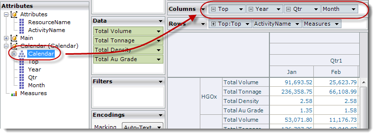
4.Drag & drop the Calendar hierarchy from the Attributes pane to the Columns shelf.
5.Expand the Calendar hierarchy to display all levels (to Month):

adding the calendar - four levels

There are four levels in the Calendar hierarchy: Top, Year, Qtr and Month. The Pivot Grid should now show the years 2012 to 2015 inclusive, broken into quarters, with each of those quarters further broken into months.

Information

The data is now in place, but differentiation between activities is not clear. To make the results clearer, you can use a colour legend.

6.Drag & drop the ActivityName attribute from the Attributes pane to the Color shelf on the Encodings card.
7.Type a title for the report in the Title card.
8.Click Save on the analysis reports toolbar.
9.Export the report to your preferred output format so that you can compare the report you just created against the saved report.
10.Close the current window.

Check your working against the Activity Mapped Schedule Report provided with the Solomon's Gold Mine sample project.

Information

If you close the report, next time you open it, XPAC opens the report in View mode. You will need to click Switch Designer Mode on the toolbar to get back to Design mode.

hmtoggle_arrow1Exploring different chart outputs

Creating an analysis report is much quicker and easier than using scripts or custom queries. Once created, you can manipulate the report even further to achieve the results you want. Try the following alterations to the report that you just created:

Remove the ActivityName attribute from the chart:
1.Drag & drop the ActivityName attribute in the Rows shelf back to the Attributes pane to remove it from the report.
2.Drag & drop the ResourceName attribute to the Rows shelf (to where the ActivityName attribute previously was).

Information

You will need to make the same change to the attribute you use as the Color on the Encoding card too, otherwise the chart will try to display all colours at once. The chart will show all of the activities that relate to each resource. For example, the Ore Miner Total Volume will include the total (remember, Total Volume was additive) of the volumes of all mapped activities related to the Ore Miner resource. This will not make much of a difference with the existing rows, because you mapped all the activities, so move to the next step.

Create a new activity map where you map only one of the activities (use a new name). Use the new measure in the table you have created, placing it on the Data card shelf next to the similar measure.
Add the Destination hierarchy to the chart by dragging & dropping the Destination hierarchy between the Source hierarchy and the ResourceName attribute on the Rows shelf. You can now see the movements between the Deposit and the Stockpiles showing totals for the activities you mapped.
Display movements without cluttering the chart rows by dragging & dropping the Destination hierarchy away from the Rows card and using it instead as a Color Encoding.
Display each individual activity by dragging & dropping the ActivityName attribute to the Pages card. XPAC splits the chart into a page for each activity. You can now use the Current Page control to switch between each activity.