Using cards |

|

|
|
Using cards |

|

|
Cards are the small boxes that you can place on the analysis report in each of the four card panes (above, below and to each side of the Pivot Grid). Each card has a shelf, on which you can drop data to define what is displayed on the Pivot Grid. You can rearrange cards and remove the ones that you do not use.
Several cards display by default. You can display other cards by clicking Cards on the toolbar and selecting them.
|
You can only drop an item onto a card once, even if the item has been filtered out. If you cannot drop an item to a card, check to see that you have not already added that item as part of another. For example, the Values measure lets you select a number of measures. If you add the Values measure to the Rows card, you cannot then add another measure to the Rows card, even if the measure you want to add has not been included in the filter of the Values measure. |
On all cards, you can click the arrow at the top right edge of the card to reveal options to hide the card or remove fields from it. Click the arrow at the right edge of any field on the card to reveal filtering options.
Drag & drop a measure to the Columns card to display a scale of the field's values along the X axis in the Pivot Grid. Drag & drop an attribute to the card to display a header for each value.
If you drag & drop a second measure to the Columns card, a second axis displays to the right of the first. If you drag & drop a second attribute to the card, the new attribute displays as a sub-header for the existing attribute.
Drag & drop a measure or attribute to the Rows card to display the field's values along the Y axis in the Pivot Grid. If you drag & drop a second field to the Rows card, a second set of labels is added to the Y axis to the right of the first.
Drag & drop an attribute to the Pages card to reveal the Current Page card.

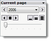
You can select the attribute value to display as the current page by:
| • | selecting a value from the drop-down list |
| • | using the arrow buttons on either side of the list to scroll through the values |
| • | dragging the slider at the bottom of the card to scroll through the values. |
You can also scroll automatically through the values using the centre row of controls on the card. The buttons on the right control the speed of scrolling, and the buttons on the left let you control the direction and to stop scrolling.
Drag & drop a measure to the Data card to display the field's data in the Pivot Grid. You cannot drag & drop attributes or Values measures to the Data card.
How the data displays depends on the data you already have displayed when you drag & drop the measure onto the card. For example, if you have only one attribute on the Rows shelf and nothing on the Columns shelf or any other card, and the Marking encoding is set to Text, adding a measure to the Data card adds a Values field to the Label encoding, and displays the newly added measure values as data labels.
If you have one measure on the Columns card and one attribute on the Rows card, and display the data as a Bar chart, adding a measure to the Data card adds a Values field to the Label encoding, and displays the newly added measure values as data labels.
If you drag & drop a second measure to the Data card, a Measures attribute is automatically added to the Rows card, and labels for the fields on the Data card are added to the Y axis of the Pivot Grid.
|
The Measures field in each list of attributes behaves like an attribute, but with members that come from measures placed onto the Data shelf. Each measure from the Data shelf has a corresponding member and vice versa. |
The Values measure correlates only with the Measures attribute. The Measures field always displays in the Level Of Detail shelf when the Values field is in the layout. As a result, you can see several data points when there are no attributes or hierarchies in the layout. This is to avoid an aggregation of several measures.
The Filters card lets you:
| • | add and remove filters |
| • | see all filtered fields in one place |
| • | apply filters based on a field even if it is not in the layout. |
|
You must filter the data when adding a filter. If you drag & drop an attribute or measure to the Filter card, but do not restrict the data, the Filter card will not update. |
To use a filter, drag & drop a measure or attribute to the Filters card to display the Manual Filter dialog box where you can select which members to display in the Pivot Grid.

If you drag & drop the Measures (attribute) or Values (measure) field onto the Filters card, the Pivot Grid will not display the filter members. Instead, the Choose Measures dialog box displays, letting you manage the fields in the Data card instead.
If you add an attribute or hierarchy to the Filter card, the dialog box displays a check tree of members. You can toggle selections of all or none by clicking All and 0 at the top.
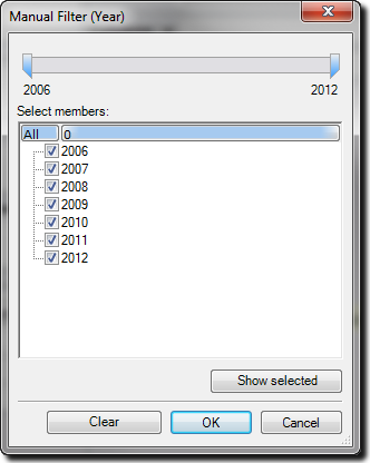
Click OK to close the dialog box and filter out all but the selected members.
Click the arrow to the far right of each filter to display a drop-down list with more options:
| • | Filter: |
| ▪ | Clear all filters for <variable name> removes the filter for this attribute |
| ▪ | Heading filter lists many options to filter out certain values for this attribute |
| ▪ | Value filter lists options to filter out certain values based on related measures |
| ▪ | Filter reopens the Manual Filters dialog box |
| • | Show quick filter displays the Quick Filters card to the right of the Pivot Grid |
| • | Remove <variable name> completely removes the attribute from the Filters card, and removes the filter from the data. |
If you add a measure to the Filter card, the dialog box displays a range of values and a slider bar. Select the Start and End check boxes to enable the text boxes and add sliders to the bar. Click OK to apply the filter to the data.
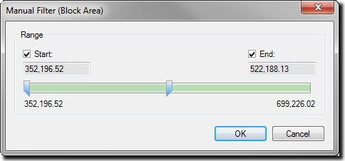
Click the arrow on the far right of each filter to display a drop-down list with more options:
| • | Filter reopens the Manual Filters dialog box |
| • | Show quick filter displays the Quick Filters card to the right of the pivot grid: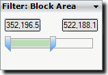 |
| • | Clear all filters for <variable name> removes the filter for this measure |
| • | Remove <variable name> completely removes the measure from the Filters card and removes the filter from the data. |
Drag & drop a measure or attribute to the Level of Detail card to add information to the Pivot Grid.
If you add a measure, the information displays as tooltip text when you hover your cursor over the row. If you add an attribute or hierarchy, the information displays as additional data points.
If you select multiple rows, the information also displays on the Summary card.
The Encodings card controls the visual representation of measure data in the Pivot Grid. You can use it to increase the level of detail using attributes and hierarchy levels, which break each data point into each of the specified encodings.
By default, there are three fields and a drop-down list in the Encodings card:
| • | Marking (drop-down list) |
| • | Label |
| • | Color |
| • | Size. |
In addition, the Shape field becomes available if you select Shape from the Marking drop-down list.
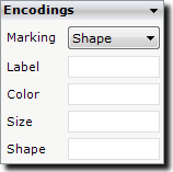
Use the Marking drop-down list to select the type of graphic to use to represent the data in the Pivot Grid. Graphics will only display if you drag & drop a measure to the Row or Column card, otherwise the Pivot Grid will display the data in a table. The following options are available from the drop-down list:
| • | Text displays a default value of Abc... until you drag & drop a field from the Attributes or Measures list onto the Label field. |
| • | Bar displays measurable data as horizontal bars. Click Swap XY on the toolbar to use vertical bars. |
| • | Line displays measurable data points connected by a line. Drag & drop a field to the Color or Size encoding to change the appearance of the line. Lines will not be drawn if the Columns and Rows cards do not contain continuous fields. |
| • | Circle displays measurable data points as dots. Drag & drop a field to the Color or Size encoding to change the appearance of the dots. |
| • | Shape displays an extra field on the Encodings card. Drag & drop an attribute to the Shape encoding to display a legend and a different shape for each type of item. |
| • | Auto lets XPAC to select the type of marking to use so that you can focus on the data. Marking type is based on the following rules: |
| ▪ | If there are no measures on the Rows or Columns shelves, the Marking type is Text. |
| ▪ | If one measure is on the Rows shelf or on the Columns shelf, and the opposite shelf ends with a date-based attribute, the Marking type is Line. |
| ▪ | If one measure is on the Rows shelf or on the Columns shelf, and the opposite shelf does not end with a date-based attribute, the Marking type is Bar. |
| ▪ | If one or more measures are on both the Rows shelf and the Columns shelf, the Marking type is Shapes. |
The Label field displays the value of any field that you drag & drop to it as a label on each data point. If you select Text for the Marking type, only the labels are displayed. Otherwise, the labels display on or near each data point.
The Color field adds a legend with a customisable range of colours that map to the customisable range of values for the field that you drag & drop to it. See Legends for more information about the Color legend.
The Size field adds a legend with a range of sizes that map to a customisable range of values for the field that you drag & drop to it. See Legends for more information about the Size legend.
The Shape field becomes available when you select Shape for the Marking type. When you drop an attribute onto it, a legend displays to the right with a list of shapes to represent the data points. You cannot drop a measure into the Shape field. See Legends below for more information about the Shape legend.
To display the Summary card, click Cards on the toolbar and select Summary.
Until you select data in the Pivot Grid, the Summary card will remain empty.
Click and drag within the Pivot Grid to select data, or hold down Ctrl while you select non-contiguous data. When you do so, a summary of all the values you selected will display in the Summary card.
In addition, the Summary card will also display the values of fields added to the Level of Detail card.
The Title card holds text to display on exported or printed layouts, as well as in the viewer.
To display the Title card, click Cards on the toolbar and select Title.
Once you add the Title card, click inside the area that states <Enter layout title here> to type text.
Right-click the title text and select Title format to open the Title Format dialog box. In this dialog box, deselect the Use defaults check boxes to enable the Font, Alignment, Fore color and Back color formatting controls.
The Description card automatically creates text that describes what the pivot table is displaying. The card automatically updates with any changes you make to the layout.
To display the Description card, click Cards on the toolbar and select Description.
Legends display to the right of the Pivot Grid when you complete certain fields of the Encodings card with a measure or attribute. The format of the legend may change depending on whether it displays details of an attribute or a measure.

The Color legend displays when you drag & drop an attribute or measure to the Color field on the Encodings card.
A measure legend displays a continuous range of colours that correspond to the scale of values for the field.
An attribute legend displays a discrete colour for each value for the field.
The Size legend displays when you drag & drop an attribute or measure to the Size field on the Encodings card.
The Shape legend becomes available when you select Shape for the Marking style, then drag & drop an attribute to the Shape field on the Encodings card.
The Quick filter that displays depends on the item (attribute or measure) added to the Filters card. See Filters for more information.